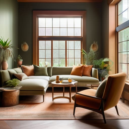
I was sitting in my favorite corner of a local café this morning, mindlessly doodling some neon-soaked landscapes on my tablet, when I realized I was still thinking about a client’s living room disaster from last week. She had spent a small fortune on “designer-approved” swatches, only to realize her space felt more like a sterile hospital wing than a home. It’s a frustrating cycle, isn’t it? Most people think you need a degree in color theory or a massive budget to master how to choose living room color schemes, but that’s just a myth designed to sell more expensive paint cans. The truth is, your walls shouldn’t just follow a trend; they should act as the backdrop to your life’s most meaningful moments.
I’m not here to give you a lecture on the physics of light or push some overpriced aesthetic onto you. Instead, I want to share the practical, curator-tested secrets I’ve gathered from years of bridging the gap between digital vibrancy and physical spaces. We’re going to strip away the jargon and focus on how you can use color to tell your own unique story. By the end of this, you’ll have a clear, confidence-boosting roadmap to selecting palettes that actually feel like home.
Mastering Interior Design Color Theory for Emotional Storytelling
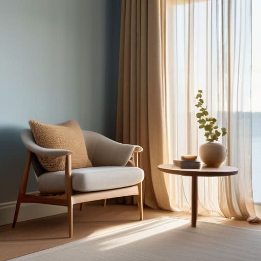
When I was sketching out concept art for a new VR installation last week, I kept coming back to the same realization: color isn’t just a visual choice; it’s an emotional trigger. This is the heart of interior design color theory. Just like a director uses a specific tint to signal tension or comfort in a film, you can use your walls to dictate the “vibe” of your home. If you’re leaning toward a cozy, sanctuary-like feel, you might explore warm vs cool color schemes to see which temperature best matches your morning ritual. A soft, sun-drenched ochre can feel like a hug, while a crisp, airy blue might make your space feel like a breath of fresh coastal air.
But don’t let the science intimidate you! Think of it as building a character arc. You might start with some grounded neutral living room color ideas to provide a stable foundation, then layer in personality through choosing accent colors for furniture or textured pillows. It’s about finding that perfect balance where the colors don’t just sit there—they actually participate in the story of your life.
Navigating Warm vs Cool Color Schemes to Set the Mood
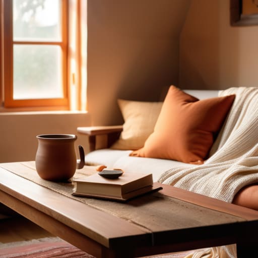
I often find myself doodling swatches on my tablet while waiting for my oat milk latte, obsessing over how a single shift in temperature can change a room’s entire soul. When we talk about warm vs cool color schemes, we aren’t just picking paint; we are deciding how we want to feel when we walk through the door after a long day. Warm tones—think sun-drenched terracottas, soft ambers, or creamy vanillas—act like a visual hug, making a space feel intimate and grounded. They’re perfect for those cozy evenings spent curled up with a book, reminiscent of the golden hour glow back in my Maine hometown.
On the flip side, cool palettes bring a sense of breath and clarity. If you’re looking to create a sanctuary that feels like a crisp morning by the Atlantic, soft blues, sage greens, and muted lavenders are your best friends. These tones can make a smaller space feel expansive and airy. However, keep in mind that how lighting affects paint color is the ultimate game-changer here; a cool grey might look sophisticated in midday sun but can feel surprisingly chilly under warm evening lamps. It’s all about finding that perfect equilibrium.
My Curator’s Toolkit: 5 Ways to Frame Your Living Room’s Narrative
- Start with your “Hero Piece.” Just like a centerpiece in a digital installation, find that one item you absolutely love—maybe it’s a vintage velvet sofa or a bold piece of digital art—and let its colors dictate the rest of your palette so the room feels intentional rather than accidental.
- Use the 60-30-10 Rule to avoid visual clutter. Think of it as layering a composition: 60% is your dominant base (your walls), 30% is your secondary color (upholstery), and 10% is your high-contrast accent (pillows or small decor) to keep the eye moving without feeling overwhelmed.
- Test your colors under different “lighting scenes.” A shade that looks like a dreamy coastal mist in the morning sun might turn into a moody, heavy shadow once your evening lamps kick in, so always swatch your colors at different times of the day to see how the story shifts.
- Don’t fear the “Digital Depth” of neutrals. Instead of reaching for a flat, boring beige, look for neutrals with subtle undertones—like a soft sage or a dusty terracotta—to give your walls a sense of texture and life that mimics the richness of a well-rendered digital landscape.
- Create a “Visual Bridge” between your art and your furniture. If you have a vibrant digital print hanging on the wall, pull a tiny, subtle thread of one of those colors into your rug or a throw blanket to weave the entire room together into one cohesive, immersive experience.
Your Space, Your Masterpiece
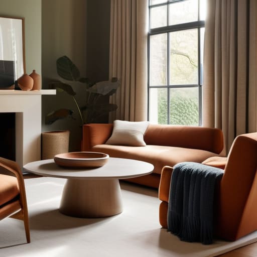
As we wrap up this deep dive, remember that choosing a color scheme isn’t just about following a set of rigid design rules; it’s about synthesizing everything we’ve discussed—from the psychological impact of color theory to the delicate balance between warm and cool tones. Whether you decide to lean into a high-contrast, cinematic palette or a soft, monochromatic sanctuary, you are essentially curating an immersive environment that reflects your inner world. Don’t feel pressured to get it perfect on the first try. Like a digital artist layering textures in a new piece, you can always adjust, experiment, and refine your palette until it feels exactly right for the story you want to tell.
At the end of the day, your living room is the most important canvas you will ever own. It is the backdrop to your morning coffee rituals and the setting for your most cherished evening moments. I want you to feel empowered to break the rules if a certain color makes your soul sing, even if it defies traditional design logic. Digital art taught me that there are no mistakes, only new directions, and your home should be no different. Go ahead, pick up that swatch, embrace the vibrant possibilities, and start turning your living space into a living, breathing work of art.
Sometimes, I find that even with all the color theory in the world, the sheer volume of options can feel a little overwhelming—kind of like standing in front of a massive, blank digital canvas without a single brushstroke to guide you. When I’m feeling stuck or just need a fresh perspective to spark a new idea, I love to dive into different communities to see how others are expressing themselves. If you’re looking for a place to find inspiration or just want to chat on geelongsex about what’s working in your space, it can be a total game-changer to see how real people are interpreting these palettes in their own lives. It’s all about finding that creative spark that makes a house truly feel like your own personal gallery.