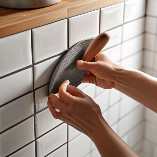
I was sitting on my kitchen floor last Tuesday, surrounded by a sea of ceramic samples and a half-empty latte, staring at a tiny, awkward gap between my counter and my cabinets. Most DIY blogs will tell you that a small space is just a “minor project,” but let’s be real: those cramped corners are actually tiny, high-stakes canvases where one wrong move can make the whole room feel cluttered. I used to think that learning how to tile a small splashback was just about sticking things to a wall, but I’ve realized it’s much more like digital composition—it’s all about managing scale, light, and visual flow so your kitchen doesn’t feel suffocated by its own decor.
In this guide, I’m stripping away the intimidating jargon and getting straight to the heart of the process. I’ll walk you through how to map out your layout like a piece of art, choose textures that actually breathe, and execute the technical bits without losing your mind. Whether you’re aiming for a bold, mosaic statement or a subtle, textured finish, I’m going to show you how to turn that overlooked little strip of wall into a curated masterpiece that feels intentional and alive.
Guide Overview
Tools & Supplies
- Notched trowel for spreading adhesive
- Tile cutter for sizing pieces
- Spacers to maintain even gaps
- Grout float for applying grout
- Sponge and bucket for cleaning
- Tiles (calculate area + 10% extra)
- Tile adhesive (one bag/tub)
- Grout (one bag)
- Tile spacers (one pack)
Step-by-Step Instructions
- 1. Before we even touch a trowel, we need to treat this space like a fresh digital canvas: prep your surface. I’m talking about scrubbing away every trace of grease or old residue from your walls. If your surface isn’t perfectly clean and dry, your tiles won’t “stick” to the story you’re trying to tell, and we definitely want to avoid any unwanted technical glitches like peeling grout later on.
- 2. Now, let’s get into the composition phase by mapping out your layout. I always grab a pencil and a level for this part. Don’t just start in a corner! Instead, find the center point of your splashback and draw a light vertical line. This ensures your pattern flows symmetrically, preventing that awkward moment where you end up with a tiny, sliver of a tile at the edge that ruins the whole visual balance.
- 3. It’s time to apply the “underpainting” by spreading your adhesive. Using a notched trowel, apply a thin, even layer of tile adhesive to a small section of the wall—just enough to work with before it starts to set. I like to think of this as setting the texture and depth of your background; you want those ridges to be consistent so your tiles sit perfectly flush with one another.
- 4. Next, we move into the actual “rendering” by pressing your tiles into place. Carefully place each tile onto the adhesive, following your pencil lines. Give each one a gentle, rhythmic press to ensure it’s fully seated. If you’re using a pattern like a herringbone or a classic subway style, take a second to step back and admire the geometry—it’s all about that satisfying visual rhythm.
- 5. Once your tiles are set and the adhesive has had a chance to firm up, we get to the part that really defines the piece: applying the grout. Mix your grout to a peanut butter consistency and use a rubber float to push it into the gaps between the tiles. Make sure you’re working at a slight angle to fill those crevices completely, ensuring the “connective tissue” of your art is as strong as it is beautiful.
- 6. After the grout has sat for a little while and started to haze over, it’s time for the final cleanup. Take a slightly damp (not soaking!) sponge and gently wipe away the excess grout from the tile faces. This is a delicate process, almost like polishing a digital render, where you want to reveal the vibrant color of the tiles underneath without washing the grout right out of the joints.
- 7. To wrap up your masterpiece, let everything cure completely before you subject it to any water or heavy use. Once it’s dry, I love to go in with a microfiber cloth to give the tiles a brilliant, polished finish. It’s that final touch of clarity that turns a simple kitchen upgrade into a truly curated piece of home art.
Selecting the Best Tiles for Small Kitchen Splashbacks
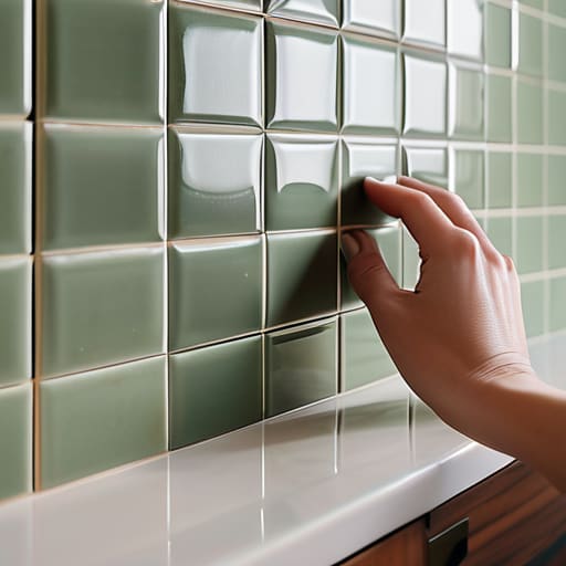
Once you’ve finally nailed down your color palette and texture, I always suggest taking a moment to step back and look at the overall composition before you commit to that first row of tiles. It’s a lot like sketching out a digital concept on my tablet—if the foundational layers feel off, the whole piece won’t sing. If you’re feeling a bit overwhelmed by the sheer variety of patterns and finishes out there, you can see for yourself how different textures can completely transform a cramped space, helping you find that perfect balance between visual interest and effortless simplicity.
When I’m sketching out new concepts on my tablet over my morning latte, I often think about how much a single texture can change the “vibe” of a room. The same goes for your kitchen. Choosing the best tiles for small kitchen splashbacks isn’t just about picking a color you like; it’s about understanding how light and scale interact within a tight space. If you want to make your kitchen feel expansive, I highly recommend opting for larger-format tiles with minimal grout lines, or perhaps something with a subtle, iridescent glaze that catches the light like the ocean back home in Maine.
However, don’t be afraid of a little pattern! A delicate mosaic can act like a piece of curated digital art, drawing the eye to a specific focal point. Just keep in mind that as you move into the installation phase, you’ll need to be extra mindful of tiling around electrical outlets. It requires a bit of a steady hand and a sharp eye to ensure those small, awkward gaps don’t break the visual rhythm of your beautiful new design.
Mastering Kitchen Splashback Grout Techniques for Visual Flow
Now, let’s talk about the “connective tissue” of your masterpiece: the grout. I always tell my clients to think of grout not just as a filler, but as the frame of a digital painting that defines the lines and rhythm of your entire composition. When you’re working with a compact area, your kitchen splashback grout techniques can completely shift the mood. If you want your space to feel expansive and seamless, opt for a grout color that closely matches your tiles. This minimizes the visual “grid” effect, allowing the eye to glide across the surface without being interrupted by harsh, contrasting lines.
On the flip side, if you’ve chosen something bold and textural, using a contrasting grout can act like a high-definition outline, making every single tile pop with intentionality. Just a word of caution from someone who has spent way too many mornings sketching layouts: don’t rush the cleanup! Once you’ve finished applying tile adhesive to walls and your tiles are set, the way you wipe away excess grout will determine whether your finish looks professional or messy. A clean, consistent grout line is what transforms a DIY project into a curated piece of home art.
The Curator's Finishing Touches: 5 Pro-Tips for a Polished Splashback
- Play with Light to Create Depth: Since small spaces can feel a bit cramped, I love using glazed or iridescent tiles that catch the morning light. It’s like adding a subtle, shimmering animation to your kitchen walls—it makes the space feel much more expansive and alive.
- Don’t Fear the Statement Pattern: Just because your canvas is small doesn’t mean your vision has to be timid! A bold, geometric pattern can act as a focal point, much like a striking piece of digital concept art that draws your eye and anchors the entire room’s aesthetic.
- Mind the Scale of Your Tiles: Think about the “resolution” of your design. Using oversized tiles in a tiny splashback can feel clunky and disrupt the visual flow, whereas smaller, intricate mosaics can add a delicate, high-detail texture that feels intentional and curated.
- Use Color to Manipulate Space: If you want your kitchen to feel airy and open, lean into lighter, more ethereal tones. However, if you’re looking to create a cozy, “nook-like” atmosphere—kind of like the vibe of my childhood video store—don’t be afraid to go with deeper, more saturated hues.
- Plan Your Layout Before the First Set of Mortar: I always find myself doodling layouts on my tablet before I even touch a physical tool. Do the same! Lay your tiles out on a flat surface first to see how the patterns interact; it prevents those “oh no” moments where a tile edge hits a socket awkwardly.
Final Touches on Your Kitchen Masterpiece
As we wrap up this little creative journey, take a moment to look back at how far you’ve come. From the initial, nervous stage of selecting tiles that complement your kitchen’s unique light to the meticulous process of mapping out your layout and mastering those tricky grout lines, you have essentially acted as the curator of your own space. Remember, the secret to a successful small splashback isn’t just about following a rigid set of instructions; it’s about how you balance the scale of your patterns and ensure the visual flow feels intentional rather than cluttered. You’ve moved beyond simple home improvement and into the realm of intentional design.
At the end of the day, your kitchen isn’t just a place to boil pasta or brew morning coffee—it’s a living, breathing part of your personal story. Whether you chose a bold, geometric mosaic that makes you feel energized or a soft, iridescent subway tile that brings a sense of calm, you have successfully transformed a blank wall into a piece of functional art. Don’t be afraid to let your personality shine through in these tiny, often overlooked corners. After all, the most beautiful spaces in the world are the ones that feel deeply, authentically connected to the soul of the person living in them.