Did you know that 90% of user engagement is influenced by visuals? This shows how important contrast in design is. It grabs attention and makes the viewer’s experience better. As a designer, knowing how to use contrast is key to making designs that capture attention and communicate well.
Choosing the right colors, shapes, or textures can make your designs better. They can look great and guide the viewer’s eye. This makes your designs not just pretty but also effective.
In this article, we’ll look at how to use contrast well. We’ll see how it boosts the visual impact of your designs. We’ll cover creating a visual hierarchy, using color contrast, and adding textures. I’ll share tips to help you improve your design projects. Let’s explore how contrast can make your designs more engaging and impactful.
Key Takeaways
- Contrast is essential for visual impact in design.
- High-contrast colors improve readability and engagement.
- Effective design uses color, size, texture, and spacing for interest.
- A clear visual hierarchy boosts navigation by up to 40%.
- Well-designed elements with contrast increase user retention and browsing.
- Incorporating varied contrasts through textures and patterns enhances audience engagement.
Understanding the Basics of Contrast in Design
In design, contrast is key to grabbing attention and guiding what we see. It’s about the differences between elements in a design. By using contrast well, designers can highlight important parts, make text easier to read, and create a clear order in their work.
Our brains quickly take in what we see in a design. So, using contrast wisely is vital for clear communication.
What is Contrast?
Contrast is a vital part of design, shaping how we see and interact with content. It decides which parts grab our attention, influencing if we want to learn more. Designers use different methods to make their work engaging and clear.
Good contrast helps make important messages clear without making the design too busy. Finding the right mix of dark and light can make or break a design’s focus.
Types of Contrast
Designers have many ways to use contrast to improve their work. Color contrast is a big one, with its bold differences between light and dark. Size contrast, like big elements next to small ones, also grabs our eye.
Texture contrast, like smooth versus rough, adds depth to a design. Each type of contrast can evoke emotions and help us understand the design’s message better.
Effective Methods to Use Contrast in Design
Understanding contrast in design can really make a difference. By using different methods, like creating a visual hierarchy and using color contrast, I can make designs more engaging. Adding various textures and patterns also helps.
Create Visual Hierarchy
Creating a visual hierarchy is key to guiding the viewer’s attention. I make sure to vary the size of elements to show importance. For example, call-to-action buttons are bigger and more noticeable than text.
This makes sure the most important parts get noticed. If everything is the same size, it can confuse the viewer. By choosing bold typography and lighter text, I focus attention where it matters.
Utilizing Color Contrast
Using high contrast colors makes designs more effective. I play with warm and cool colors or light and dark shades to create striking combinations. Choosing the right colors is important for both looks and function.
Tools like Coolors help me find great color schemes. Using bright colors against dark backgrounds improves clarity and focus. This makes the design more engaging and memorable.
Textures and Patterns
Adding contrasting textures and patterns adds depth and interest. For instance, a rough texture behind smooth text adds character. By trying out different textures, I create a captivating environment.
Using consistent patterns unifies the design, while contrasting elements keep the viewer’s interest. This not only makes the design look better but also encourages interaction and curiosity.

Conclusion
Using contrast in design is key to making content that grabs attention and sends messages clearly. By carefully choosing design techniques, like setting up a visual order and using color, I can make designs that stand out. Mixing different sizes and shapes makes my work more appealing and clear.
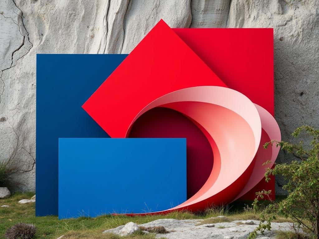
Thinking about the design methods I’ve learned, I see that keeping it simple is best. For example, using one organic shape with geometric ones can really grab someone’s eye, in things like posters or layouts. Also, I’ve learned that using two to three fonts is best, as too many can make things hard to read.
As I keep learning about contrast, I’m excited to get better and try new things. The stats on how people notice contrast remind me of its big impact on keeping people interested. By using what I’ve learned, I can make designs that really speak to people.
